

Control charts have been around for nearly a hundred years, and enthusiasts have long promoted their use in the NHS. Yet somehow they never quite hit the mainstream.
That could be about to change.
There is growing recognition at NHS Improvement and around the analyst community, both of the power of control charts and their potential to improve the management of the NHS.
So what is control charting (also known as Statistical Process Control or SPC charting)?
How does it differ from a straightforward chart of performance over time?
And why does it make such a big difference to managers?
Out of control?
The first and most important question is whether the system you are measuring is “in control” – in other words, whether its performance is stable and varies within a predictable range.
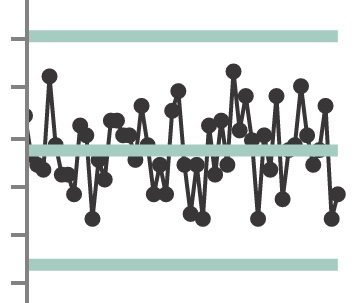 For instance the control chart on the left shows a system that is “in control”. (This one shows the net change in non-elective beds – admissions minus discharges – in an acute ward block on a particular weekday over 12 months.)
Your control charting software will automatically check for signs that the system is not in control – things like massive one-off variations, clusters of points with large variations, or runs of points with unusually little variation. If it finds anything then it will highlight those points (usually in red).
So if you see a lot of unexpected red in your control chart, it means your system is not statistically “in control”. This is vital management information, and you will want to do something about it by addressing the poor standard operating procedures, chronic staffing problems, haphazard management, or whatever it is that needs fixing before the performance of the system will be stable and predictable.
In control, but performing badly?
If it is “in control”, does that mean performance is good? Not necessarily, and this is one of the most important things to understand about control charts. It is perfectly possible for a system to have stable performance within predictable limits, but for that performance to be consistently disappointing.
You can see confusion about this in many NHS Board reports, which describe how managers are analysing the causes of the latest breach in access or safety standards, when it is clear from the historical data that breaches are well within the normal range of performance of that system.
In process control terms this normal range of performance is called “common cause variation”.
If a system is in control but performance is worse than wanted, then there is no point in examining the individual breaches. You need to improve the system which consistently delivers such poor performance.
After taking action, you will want to see if your changes worked – and again control charting can tell you.
Your control charting software should allow you to split the data series at the point when the improvement was made. After the change, you should see that performance is “in control” and varying predictably. Naturally you will also want to see that average performance has improved. On its own, however, that isn’t enough.
What you really want is for undesirable levels of performance to be rare. Your control charting software shows the upper and lower “control limits” within which performance usually varies (the outer blue-green lines in the chart above). So you want to see control limits that are mostly or entirely within the range you want. Only then can you say that the system is set up to deliver consistently acceptable performance.
In control, but something happened
Stuff happens sometimes and performance can be badly affected, even in systems that are generally “in control” and performing well. This kind of variation is called a “special cause” because it is genuinely exceptional, usually external to the system, and it is not part of the usual variation.
This time it is worth understanding the cause of that particular event. It may not be hard to find – a power failure or some other major incident perhaps. Or Christmas.
If the event is recent and you cannot find an external “special cause”, this might be an early warning that the usual range of performance has shifted, or even that the system is starting to go out of control – things like staffing changes, or wider organisational problems, or a backlog building up. A recent red point on your control chart could be the earliest sign that something fundamental has changed and needs urgent management attention.
So control charts are much more helpful to managers than the usual time-series “run chart”. And now that you know the difference between the usual range of performance, and things that were genuinely exceptional, you can save yourself a lot of effort. After all, why keep blaming poor performance on special causes, when actually the system as a whole needs improving?
Control charting is now built into Gooroo Planner. For powerful analysis of your bed, theatre and clinic performance, follow this link to learn more or ask us to come on-site and give you a free demo.