I want to see your waiting times recovery plan.
I want to know how many long-waiters you’ll have at the end of every week.
And I want to track performance against it every week too.
Sound familiar? This is happening all over the UK as hospitals struggle to sustain their waiting times targets, and attempt to recover their positions before next winter arrives.
What the speaker of such words may not fully appreciate is that they are wading into some really difficult modelling territory, because the number of long-waiters is very sensitive to exactly how the waiting list is being managed. But it is still a sensible thing to ask for, and it can be done.
Here we are going to look at two case studies where there was a discrepancy between real life and modelled long-waiters, and see if we can work out the reason for it. They are used here with the permission of the hospital concerned, and all the modelling was done using Gooroo Planner.
Case study 1 – breast surgery
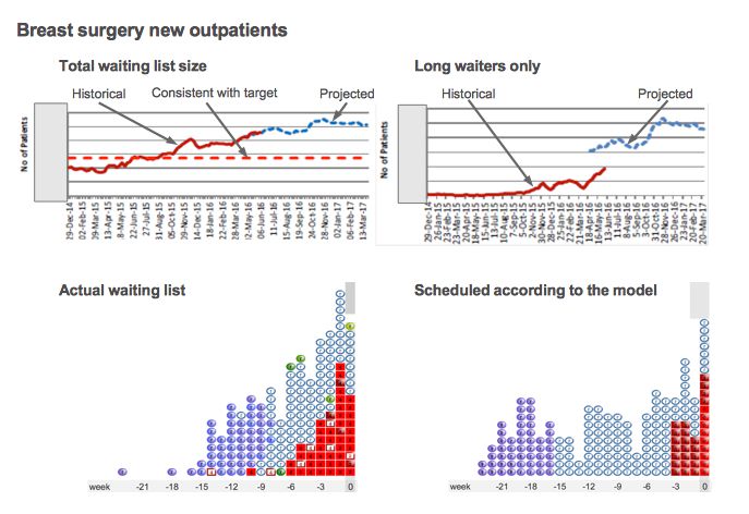
The top two charts above are taken from the hospital’s regular trackers, which they update monthly.
At the top left we have the total size of the new outpatient waiting list. Historically this list has been growing, and it is now too large to sustain the waiting time target, even with good patient scheduling. The projected waiting list size is based on an agreed local activity plan and historical trends for activity and demand; on that basis, the size of the waiting list is expected to remain above target for the rest of the financial year. As you would expect, the projected list size picks up where the historical list size left off.
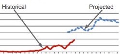
At the top right we have the number of long-waiters over the same period. But this time there is a large gap between the historical and the projected lines. The reason is that the projected long-waiters are modelled using assumptions about waiting list management, and those assumptions evidently differ from the real-life waiting list management. So if we can understand those differences then we can understand and resolve the gap.
Which brings us to the two images underneath. On the left is a snapshot of the actual waiting list – each blob represents one patient (to make the image manageable with large waiting lists it actually shows a representative sample of patients on the list), and the numbers underneath show how long they have waited so far (so the long-waiters are towards the left).
There is a lot of information in the image, but in this case you only need to know one thing: the red rectangles are clinically-urgent patients, and the ovals are routines.
On the right is another snapshot of the waiting list, after simulating those patients being scheduled according to the modelling assumptions. The total number of patients is the same in both the left and right images, but you can see that the number of long-waiting patients is very different. So the question is why.
In this case it’s all about the urgent patients. The number of urgent patients on the list is very different in real life compared with the simulated list. The model has been told to assume that urgent patients are all seen within 4 weeks, but it is clear that in real life they commonly wait much longer. And although the proportion of urgent patients has been measured from the declared urgencies in the patient-level data, it looks as though fewer patients are being managed urgently in practice.
This explains the difference – in the model, more urgent patients are treated more quickly, which means more queue-jumping, which means the routine patients wait longer, which means the model is projecting a higher number of long-waiters.
So the question for this outpatient breast service is: how many patients are genuinely urgent and how long should they wait? Is it clinically appropriate for them to wait up to 7 weeks (in which case we can change the model’s assumptions to match)? Or should they actually be treated within 4 weeks (in which case the model’s projections are the safer and more realistic ones)?
Case study 2 – orthopaedics
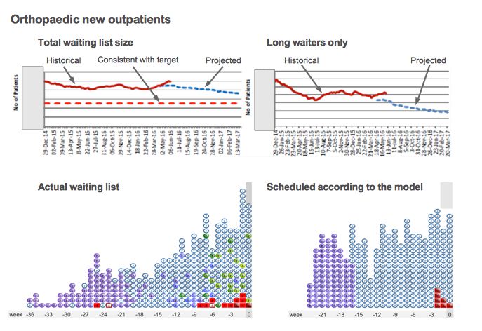
The second case study is orthopaedic new outpatients. In this case you can see that the waiting list is already deviating from plan, and is larger than intended. That will clearly be of concern to managers locally, but here we will just focus on the difference between the projected long-waiters and the actual number.
Here the gap is the other way around – the real number of long-waiters is larger than in the model. This is very common. Although the model takes into account clinical priorities, and disruption caused by removals and other kinds of random event, it is common for real-life waiting list management to introduce further disruptions that push up waiting times.
The usual way to allow for this is to allow a margin for error in the model, by setting the model’s waiting time target a bit shorter than the target that must be achieved in real life. The hospital has not actually done this in this particular model, and it would be a sensible first step. But for the purposes of this case study it is helpful that they have not built in a margin for error, because it allows us to make a direct comparison.
In this case the most likely explanation for the discrepancy is subspecialisation. Orthopaedics is commonly subspecialised, at the very least into upper and lower limb, and sometimes right down to shoulder, elbow, hand, spine, hip, knee, foot and ankle, with further possible subspecialisation to revisions of previous operations. A judgement usually needs to be made about whether, and to what extent, the specialty should be divided up into subspecialties in the model.
Here the whole specialty is being modelled in one lump, which effectively assumes that this waiting list acts as a single queue. The simulator image to the lower right shows how the waiting list might look if that were true.
Looking at the real-life waiting list to the lower left, you can imagine how it could be a combination of (say) two waiting lists: one with long waiting times going out to around 30 weeks (perhaps for hips and knees), and another with short waiting times going out to around 15 weeks (perhaps for upper limb surgery).
So the solution is to split the data up and model those subspecialties separately. Then we would get a more accurate projection of the number of long-waiters in each subspecialty. And when we add those subspecialty long-waiters together we would get a more accurate total.


