

(Guest post by Mike Davidge)
Rob Findlay in his recent blog posts about control charts (here and here) has written about two different types of variation. He referred to them as ‘common cause’ and ‘special cause’ variation. But what are these and why are they so important?
To explain why, I’m going to take you to an everyday example. One that is not related to the type of data you look at as managers or the processes that generate that data – your journey to work. And I’m talking about a journey that has the same start and end points every day, which will be true for the vast majority of you.
Your predictable journey to work
If I were to ask you how long it took, you would be able to give me a good estimate. That estimate though would not be a single number. You wouldn’t say “It takes me exactly 29 minutes.” Instead you might say “It takes me about half an hour.” If I were to press you further to be more precise, you might say “Well somewhere between 20 and 45 minutes under normal circumstances.”
Where have you got your estimate from? Well for a start you will have done that particular journey dozens if not hundreds of times. You are an expert in your journey to work. You know that there are lots of factors that influence the time: exactly when you leave home; how many traffic lights are on red (or green); how many cars are ahead of you at that tricky right turn; how easily you find a parking space and many more.
These examples are for those of you who drive to work. But if you rely on public transport or cycle or walk, there will be a range of different factors that affect your journey in a similar way.
All those different factors combine from day to day to give that range of 20 to 45 minutes that you quoted. You know it’s not worth bothering trying to work out why it took you 5 minutes longer today. Instead you recognise that your chosen journey takes what it takes and you plan accordingly.
If you have to be at work for 9am say, then it’s unlikely that you’d choose to leave for work at 8.30am. Although on average you’ve got enough time, you know that leaving then will make you late too often. So you might leave at 8.15 or, if you’re the type of personality that likes to get there early, maybe even 8am. Whatever you decide, you will have based your decision on the predictable process that is your normal journey to work.
‘Common cause’ or ‘special cause’?
What I have just described is ‘common cause’ variation. The variation in any measure, such as “how long does it take me to get to work?”, is caused by a common set of factors that are part of the process the measure is describing. All processes display this phenomenon. And it is the reason behind the phrase “Every process is perfectly designed to get the results it gets”.
Once we understand this variation, we know what we are going to get in future under normal circumstances.
Which brings me to the second type of variation – special cause variation, or the result when circumstances are not normal.
There are some journeys to or from work that don’t go according to the norm. There might have been an accident on the motorway, a train strike, a puncture in our rear bike tyre or half an inch of snow. Now our journey to work will take considerably longer than ‘normal’. But this time we can point to the reason why.
And because we can identify it, we can do something to mitigate the effect, a Plan B. We probably have an alternative route home that avoids the motorway. If there is a train strike, we might be able to work at home. If we know about the snow in advance, we might leave for work at 7am not the usual 8.15am or take another mode of transport.
We base our decisions about our journey to work on the type of variation that we think is in place. We only use Plan B if we need to. We wouldn’t dream of leaving for work at 7am just in case there was an accident this morning.
Variation in the hospital
So let’s bring that knowledge of common and special cause variation into our decision making at work, as well as about how and when to get to work. To be able to make sensible decisions about what we need to do, we first need to know what type of variation we are dealing with.
And that means using a proven method that distinguishes the two. Control charts (also known as Statistical Process Control or SPC charts) are that proven method. They were designed specifically with this in mind.
How would using them change the way we react to our latest performance report? Here are two examples of how the traditional RAG table approach could lead you astray. They are both taken from actual Trust performance reports.
In the first example, a Trust is tracking the activity against plan for their Podiatry service. They aim to be within 5% of plan each month. In the current month they have fallen outside that range at 94%. This is flagged as ‘red’ just so you don’t miss it.
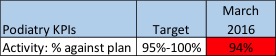
The temptation would be to go looking for the reason for this drop in performance. However a brief look at the SPC chart for the actual activity would tell a different story.
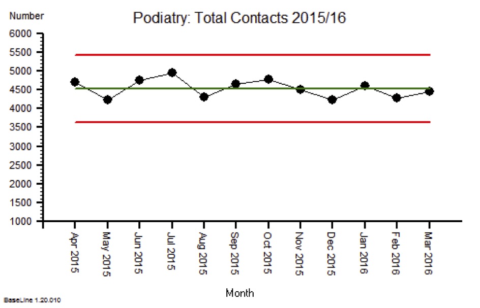
This control chart shows total contacts per month over the financial year to March 2016. The green horizontal line on the chart is the average and indicates that they delivered, on average, around 4500 contacts per month. The red lines are the upper and lower control limits and represent the range of common cause variation in this process. All of the months fall within these limits, indicating that none of them deserve special attention.
So although March 2016 is below the plan, it is not ‘special’ and so any investigation will not find a root cause because there are none to be found. The danger is that, having gone looking, we think we have found something and react accordingly. That change won’t solve the problem though and we will be no better off than before. If we are persistently late for work, we shouldn’t keep blaming the traffic. We should change our regular routine and set off for work earlier. The chart is indicating a similar approach is necessary here. We need to change the way the service is set up.
In the second example a Trust is monitoring their compliance with the Patient Safety Thermometer, a composite measure of 4 key patient harms. Everything looks rosy doesn’t it? In the current month (September 2015), they are well above the national target and have improved on the previous month. And this isn’t a flash in the pan. The Q2 performance is also above target. Faced with discussing the other 55 KPIs, all we do here is simply move on.
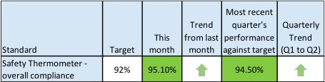
But if we had bothered to study the SPC chart, it would have given a little cause for concern.
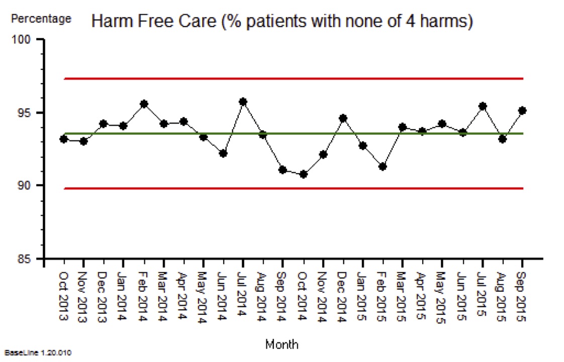
This control chart shows the same measure plotted monthly since October 2013. As in the earlier chart, the green line is the average and shows compliance at around 93.5%. That is above the 92% target so ok so far. There are no special causes in the chart so this is a stable system showing only common cause variation around the average.
Now look at the lower control limit, it’s under 90%. This means that this process could possibly deliver values as low as 90% in future, below the 92% target. The chart is therefore warning us that we should not be confident of always hitting the target.
Armed with this information, the management team should now adopt a ‘common cause’ strategy. They should task someone with finding out why the process is so variable and act on those sources of variation by redesigning the process.
(Mike Davidge is a director with NHS Elect)