

Your RTT charts are available at gooroo.co.uk/reports/
It is all too common for NHS performance reports to say a lot about “what” is happening, but very little about “why”. Sometimes they convey even less information, using red/amber/green ratings to state simply whether a target was met (or not), which at best is uninformative and at worst fosters a blame culture.
So there is a pressing need for performance reporting to be more informative, and to tell a better story about what is really going on. How can we do this for referral-to-treatment (RTT) waiting times?
Many performance measures can helpfully be presented using control charts, which can reveal fundamental truths about how performance varies. But unfortunately they don’t work for RTT waiting times, which means we need to take a different approach to understanding the causes of long waits.
So in this piece, I would like to explain the approach we have taken in our monthly RTT reporting, both to help you interpret these reports when you receive them (they are available free of charge here), and to promote the development of more helpful and informative performance reporting across the NHS.
The two causes of long waiting times
Elective waiting times are a function of two things: the size of the waiting list, and the order in which patients are treated. We know this from everyday life: a longer queue means longer waits, and if some people jump the queue then others wait longer.
Because the size of the waiting list varies over time, so do the sustainable waiting times, and this means that RTT waiting times are never in statistical control. That is why we cannot use control charts to understand them.
So we need another way of revealing the underlying drivers of long waiting times, and our monthly RTT charts do this by modelling the waiting times that would result from good patient scheduling. Here is an example:
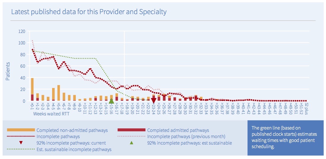
The dotted red line shows a snapshot of the waiting list (the ‘incomplete pathways’ in RTT jargon) for this service (Orthopaedics at a particular NHS trust). The red triangle shows that 92 per cent of the waiting list extends to nearly 24 weeks, breaching the target of 18 weeks. But why?
If waiting times are too long, then either the waiting list must be too big, or patients must be being treated in the wrong order, or both. We want to know which, and the green line helps us with the answer.
The sustainable waiting time
The green line models the same size of waiting list, but this time on the basis of good patient scheduling. It doesn’t assume a perfect first-come-first-served queue like the one in the Post Office (which is what ‘clearance times’ would represent), but a reasonable one that takes into account clinical priorities and the disruptions caused by randomness, removals etc.
The formula used is the same as we use in Gooroo Planner, although for these charts we have had to estimate urgency rates from the published data (whereas a local analysis using hospital data would be based on patient-level urgency coding).
It shows that shorter waiting times should be sustainable in this specialty, and the green triangle shows that waiting times would be reduced to 92 per cent within 16 weeks with good patient scheduling.
It would also be possible (of course) to shorten waiting times by reducing the size of the waiting list, which would require extra resources, but in this case the green line suggests we could do it with better patient scheduling alone.
Waiting times by stage of treatment and subspecialty
What else can the chart above tell us about patient scheduling? Take a look at the columns. They show how long patients had waited when they were treated and discharged (the ‘completed’ waiting times for ‘clock stops’, in RTT jargon). The orange columns show how long the outpatients had waited (‘non-admitted clock stops’) and the red columns show how long the inpatients and daycases had waited (‘admitted clock stops’).
There is a prominent peak in the orange columns at 5-6 weeks, which suggests that new outpatients are typically seen after a 5-6 week wait which is quite common and sensible for a surgical pathway like this. There is also a peak very early on at 0-1 weeks, which probably represents the most urgent elective patients. Then there are smaller orange columns at higher waiting times, which may represent patients being discharged from clinic following diagnostic scans – these are guesses because unfortunately the published RTT data does not distinguish between these different patients.
The red columns are more spread out, with peaks at around 16, 25 and 31 weeks. These may represent the typical RTT waiting times for surgery in the various subspecialties of Orthopaedics (hips, hands, etc), and suggest that resources may need to be shifted between subspecialties if those pressures are to be evened out, and thereby improve patient scheduling across the specialty. This is not easy, but it is always helpful to have an indication of the challenge.
Huge amounts of information
Charts of this kind are capable of revealing huge amounts of information about the service, such as:
- whether long waits are caused by an oversized waiting list, or whether they could be solved with better patient scheduling and internal resource allocation alone (as discussed above);
- whether there is a risk that patient scheduling has reached its safe limits as a tool for achieving waiting time targets (if the sustainable waiting times are longer than actual waiting times);
- whether resources should be shifted between clinic and theatre sessions (if long waits are concentrated in one area or the other);
- whether there are problems with the data quality (although this is sometimes confounded by tertiary referral patterns), for instance:
- delays in recording patients on the system (shown by a dip in short-waiters on the list – see first example below),
- inaccurate clock starts data (shown by the green and red dotted lines reaching the y-axis at different heights – see first example below),
- anomalies where the non-admitted clock stops exceed the supposed clock start rate – see second example below),
- late validation of waiting list patients, or the use of clock pauses,
- unexpectedly low rates of clinical urgency.
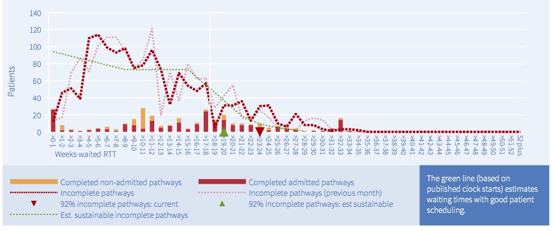
Missing short-waiters and a low clock start rate compared with incomplete pathways
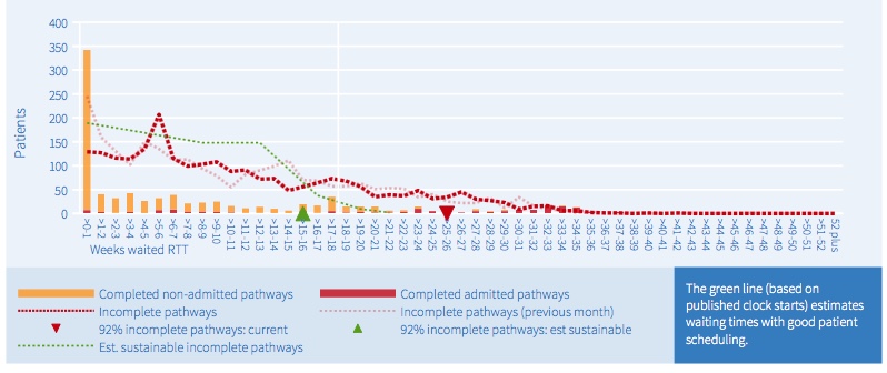
Spike in short-wait non-admitted clock stops is higher than supposed clock start rate
More revealing time trends
Time trends are useful, partly for showing us what has already happened, but also for indicating what is likely to happen next.
The chart below shows the time trend for a range of RTT performance measures.
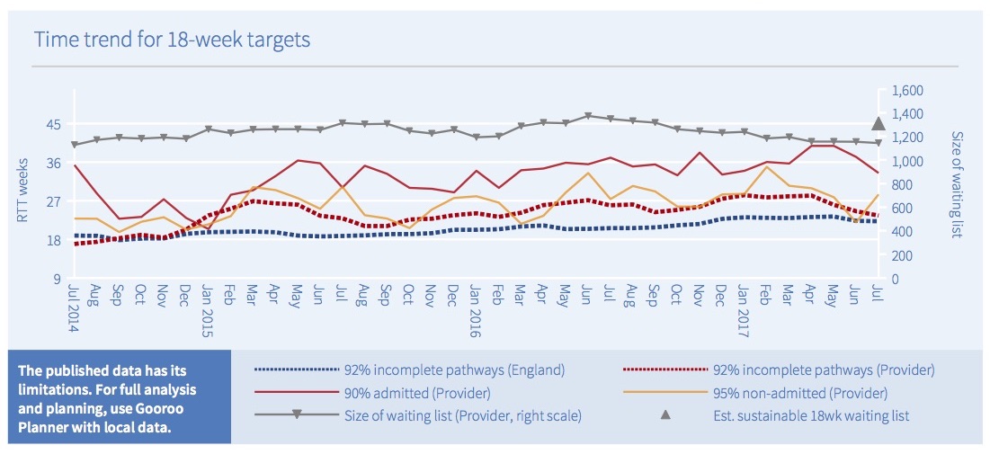
Although the dotted red line attracts the most attention (because it relates to the 18 week target), actually the grey line is the most important one to start with. Put simply, if the waiting list is growing over time then so is your problem – this is the best leading indicator of the pressures to come.
The grey triangle estimates the sustainable waiting list that is consistent with achieving 18 weeks, on the same basis as the green triangle in the first chart above shows the sustainable waiting time. So this chart indicates that the actual waiting list is small enough to achieve 18 weeks (even though the service is breaching in reality), in the same way as the green triangle in the first chart above shows that the sustainable waiting list size is below 18 weeks.
The other lines show the three published 18 weeks measures, and (crucially) they show the position in terms of weeks waited, not as less-informative percentages which fail to show approaching problems as the waiting list grows.
Waiting times are particularly influenced in the short term by patient scheduling. This is typically highly inconsistent in the NHS, as shown in the chart above by the highly variable waiting times for admitted and non-admitted completed pathways.
If there were less variation in those admitted and non-admitted waiting times, that would be a good sign that patients were being scheduled according to their needs, rather than according to the target. It is after all perfectly possible to schedule patients safely and fairly according to their needs, and yet still breach the target because the waiting list is too big.
Limitations of the published statistics
There are limitations to this analysis because of the way the national statistics are collected.
Firstly, these statistics are on an RTT basis so they do not reveal the separate pressures on new and follow-up outpatient waiting times, inpatient and daycase waiting times, and diagnostics.
Secondly, they show the whole specialty in one lump, which is usually alright in some specialties like Urology and Ophthalmology, but less helpful in highly subspecialised ones like General Surgery and Orthopaedics.
Thirdly, the complexities of RTT data recording mean that these statistics are more prone to error and inconsistency than data for each stage of treatment separately.
And finally, they show what just happened, but give only a limited insight into what is likely to happen next.
For all those reasons, you will get more detailed and insightful analyses and forecasts by modelling your local data in Gooroo Planner – if you haven’t seen it recently and would like to, then please get in touch to arrange a free on-site demo.