

Your A&E control charts are available at gooroo.co.uk/reports/
The A&E waiting times standard is currently the highest-profile performance target in the English NHS. Unfortunately it is also commonly breached.
There are many possible reasons for this, as the breadth of this collection of resources from NHS Improvement shows, although the exact causes will vary from hospital to hospital. Some lie within the A&E department, such as shortages of staffing and capacity, staffing patterns not matching demand patterns, or poor flow within the department. Some lie in the wider hospital behind it, such as difficulties navigating patients to the appropriate clinicians and supporting services, and (particularly) bed congestion.
How control charts work for A&E waits
So we need to monitor performance against the A&E target in a way that helps us understand the caused of any breach. Red/amber/green ratings can be highly misleading (as explained beautifully by Mike Davidge of NHS Elect here) – what we need instead are statistical process control charts (also known as SPC charts or simply control charts) because they are specifically designed for understanding variations in performance.
Control charts can help us to understand A&E waiting times in several ways:
1) They can tell us if our systems and processes are stable. If they are, then the control chart will show that performance is varying within predictable limits. If they are not, then that is useful information too – it means that something fundamental about our systems and processes is changing over time. We should then be able to use operational knowledge to identify what is happening, and it is important that we do because we will not be able to deliver predictable levels of performance until we can get it under control.
2) If our processes are stable, then control charts can tell us whether they are designed to breach the target. That might sound like an odd thing to say, but this point is key. The performance of a stable process will vary randomly within predictable limits. If that predictable variation extends into breach territory, then our usual performance is expected to breach the target from time to time. To stop this from happening, we need to redesign our systems and processes so that the usual range of variation will fall mostly or entirely within the target.
3) Control charts tell us whether any particular breach of the target was a genuine one-off. If our processes are designed to achieve the A&E target consistently, and we suffer a breach that is truly exceptional, then the control chart will show that the breach was outside the usual range of variation. In that case we should be able to identify the cause.
NHS Improvement have published a good introduction to control charts here
Example of an A&E control chart
Let’s look at an example of an A&E waiting times control chart, which (like all our A&E control charts) is based on data for Type 1 (major) A&E departments published by NHS England.
The target since July 2010 is described in NHS England’s statistical commentary thus:
The operational standard for A&E waiting times is that 95% of patients should be admitted, transferred or discharged within 4 hours of their arrival at an A&E department.
There are lots of different types of control chart, and we have chosen one which is suitable for percentage breaches of this kind. The upper and lower control limits (within which usual variation is expected) depend on the number of patients in each month’s data, which is why the blue-green lines vary over time.
(For those who are interested in the technicalities… For an NHS-friendly explanation of the main types of control chart, see this guidance from ISD Scotland. The chart we have chosen is a Laney p’-chart with sigma-z >= 1, because this avoids overdispersion when p-charts are based on the large sample sizes which are usual in A&E – for an explanation see this paper. All the statistical analysis was based on percentage breaches, and then the numbers inverted for comparison with the familiar target.)
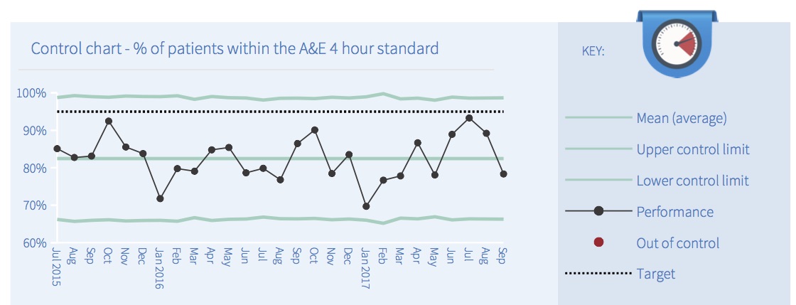
In this example all the points are coloured black to indicate that the system is ‘in control’. If any out-of-control points had been detected then the software would have coloured them red, using the following five tests:
- Outlier: any point outside the upper or lower control limits.
- Shift: a run of 8 or more consecutive points all on the same side of the mean.
- Trend: a run of 6 or more consecutive points either continuously rising or continuously falling.
- Outer third: 2 out of 3 consecutive points which lie close to a control limit.
- Inner third: 15 or more consecutive points which lie close to the mean.
What is the point of these tests? They are checking whether the variation is random or not. If the system is in control, then all the variation should be random. So these tests are looking for patterns that are very unlikely to happen by chance, and if they find any then that is a sign that something non-random has happened and the system was therefore not ‘in control’.
The next image shows how the monthly A&E reports explain the results of the five tests. If any test fails, then the box beside that test will turn red, and the big summary box on the left will also turn red.
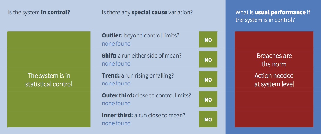
All those green boxes on the left mean that this trust’s A&E performance is in statistical control, so the good news is that performance is predictable. But that doesn’t necessarily mean that performance is good.
We saw from the control chart above that this trust’s usual range of performance is almost entirely outside the target – in other words, breaching is absolutely normal here. This is indicated in the image above by the right hand panel which is red.
So this is an example of a system that is in control, but expected to breach the target consistently. Managers should therefore forget about investigating any particular breach, and focus instead on redesigning processes at system level so that the usual range of variation is within target.
Taking action to improve performance
What if you did take action to improve A&E waiting times?
If you were analysing performance using your own control charts, you would put a break in the time series to show how performance improved after your intervention.
Unfortunately we cannot do the same with these monthly control charts, because we don’t know what action people have taken or when. So these charts would interpret the improvement as meaning the system was not in statistical control (which it wasn’t, albeit for good reasons), and predicted performance would be based on the whole time series rather than the period after you took action.
Nevertheless you should be able to see the improvement in the control chart, using your local intelligence about when it happened, and watch the benefits feed through as time goes by.
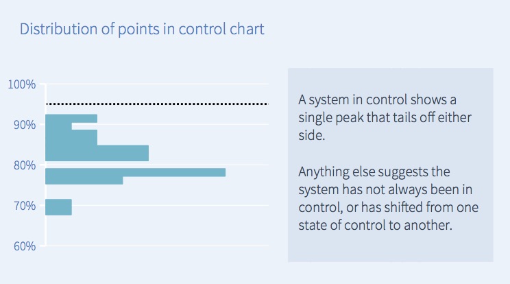
The distribution of performance
Finally, there is a chart at the bottom of each monthly A&E report showing how common each level of performance was. In this example, the largest number of points in the control chart lie just below 80 per cent, so in the corresponding distribution chart below the largest bar is just below 80 per cent.
If the process is in control and variation is random, then you would usually expect the distribution to look like the one below – a central spike that tails off on both sides. However sometimes you may see a different distribution, which may be a sign that the pattern has changed or is out of control.
Beyond A&E – using control charts more widely
Control charts are powerful, and you may want to use them to understand other aspects of your trust’s performance.
So we have built control charting into our Gooroo Planner software to analyse bed, theatre and clinic utilisation as well as patterns of activity and demand. These tools can help you understand and solve your regular capacity pressures, as well as plan the capacity you need, and so improve your A&E, RTT and cancer performance.
You can find out more about control charting in Gooroo Planner here, or get in touch and ask for a free on-site demo.