

See also: the Detail | the Overview
The Charts view gives you powerful statistical analyses of bed, theatre and clinic usage and waiting list movements on different days of the week. So you can quickly see the causes of capacity problems, where there may be opportunities to improve performance, and where you could increase the capacity allocated to each service.
Each analysis centres on a control chart. Unlike a normal run chart, which simply tells you how the system performed over time, a control chart tells you:
- whether performance is stable and predictable (“in control”),
- the range of performance you should usually expect from the stable system, and
- whether at any time the system was out of control and performance was unusual.
This is useful because, if performance is worse than you wanted, you can tell whether something unusual went wrong (in which case you can go and investigate the root causes of that event), or whether this is just part of the usual range of performance you should expect from the system (in which case there is no point in investigating the root cause of that event – you need to improve the system if you want to improve performance). You may also see these referred to respectively as “special cause” and “common cause” variation.
Gooroo Planner provides control charts covering a range of statistics for beds, theatres, clinics, and other measures. For example, the following charts show non-elective admissions to hospital beds:
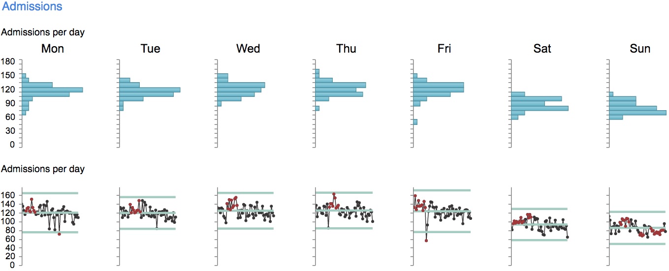
The first row of charts (the histograms) shows how common it is to see each number of admissions per day. You can see that from Monday to Friday, non-elective admissions are fairly stable at about 120 per day with a range of variation from about 60 to about 150 admissions per day. At weekends there are fewer admissions – more like 80 per day on average.
The second row of charts (the control charts) shows the exact number of admissions every day over the last 12 months. The two rows of charts are related, because the longest bar in a histogram is at the level where most of the points are clustered in the control chart below it. So from Monday to Friday, most of the points in the control charts are clustered around 120 admissions per day, but at the weekend they are clustered lower. (You can click the image above to see a larger version.)
Three blue-green lines are superimposed on each control chart to show the usual behaviour of the system: the middle line is the mean (average), and the outer lines are called the upper and lower control limits.
Some of the points on the control chart are picked out in red, to show where performance was so unusual that you would not expect to see it happening by chance in a stable and predictable system.
For instance, any point falling outside the upper or lower control limits is red, and so is a long run of points on the same side of the mean. Those are just two of the rules – there are eight in total, and the ones we have used are called the Nelson Rules, and they are designed to pick out special causes of variation. You can see unusually low red points where there was a bank holiday (on a Monday), and at Christmas (which fell on a Friday – when you are in Gooroo Planner, you can hover the mouse over any point to get a tooltip showing the date).
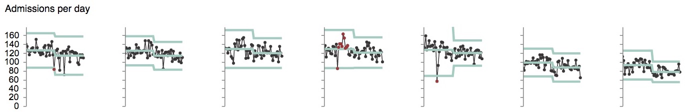
If you have taken management action in real life to change how the system behaves, then you will want to see whether your action was successful. You can do this by splitting the chart on the date the change was made.
For instance, here are the same charts, but with a split in the middle. You can see from the blue-green lines that the system performance was somewhat different after the split, particularly the last two charts showing the weekend. Most of the points that were red in the previous charts have gone black, now that the behaviour of the system over different time periods has been taken into account.
Further charts for this data (which I won’t include here) show that non-elective discharges also fall at weekends. But crucially, they fall even more than admissions do. So the beds tend to fill up with non-electives at the weekend, and are fullest on a Monday morning which is just when elective inpatients are wanting to come in for their operations. Other charts show that weekend patients are more likely to be admitted to the wrong ward, and have a longer and more variable length of stay.
So the conclusion from this example data is that, if the hospital could discharge more patients over the weekend, then that would solve a lot of problems. This is similar to findings in a published study of another hospital, where improving weekend discharges was projected to improve performance against the A&E target.
Control charts available
There are four views available, and the measures available in each view are:
- Bed view: admissions per day, discharges per day, net change in beds per day, ALOS by admission day, ALOS by discharge day, wrong ward by admission day;
- Theatre view: late starts, early/late finishes, turnaround times, first to recovery;
- Clinic view: late starts, early/late finishes, turnaround times, first out of clinic;
- Other view: activity per day, additions to the waiting list per day.
And for each measure there are three rows of charts:
- a histogram, showing how commonly each range of values is found over the time period selected;
- a control chart, showing the exact performance every day, and whether or not performance is stable;
- a time of day chart (not shown above) showing how performance varies by time of day (e.g. whether beds tend to fill up in the morning and empty in the afternoon).
Filters are available for all chart selections, allowing you to choose the historical time period to study, and which services to include (down to any level of detail that you have included in the patient-level data files, including down to consultant level).
Because every chart requires a lot of analysis, and there are so many charts on each page, it does take a few minutes to display each page of charts. I wish it were quicker, but there we are. The depth and power of the analysis should make it all worth waiting for.
You will need to include certain fields in your patient-level activity files to display these charts, in addition to the usual fields that you are uploading to run Gooroo Planner for planning purposes. The fields are:
- BedWardID, BedIntendedWardID (to get the ‘wrong ward’ charts)
- BedAdmissionDate, BedDischargeDate, BedLOS (to get the admission and discharge charts, and their respective ALOS charts)
- TheatreID, TheatreSessionID, TheatreSessionMins, TheatreSessionStart, TheatreAnaeStart, TheatreSurgeryStart, TheatreSurgeryEnd, TheatrePatientOut to get the theatre charts
- ClinicID, ClinicSessionID, ClinicSessionStart, ClinicPatientIn, ClinicPatientOut to get the clinic charts
These fields are documented in the Gooroo Planner documentation. As always, if you don’t have certain data available, then don’t worry because you can still obtain analyses from the data that you do have. And we are always on hand to help you if you get stuck.