
Ah, those pesky patients. You try your hardest to get them treated within 18 weeks, and sometimes they just won’t come in when you want them to.
It is of course entirely up to the patient, and quite right too. That’s why the targets allow for a proportion of patients to wait longer than 18 weeks. But when you’re managing a service that’s right up against the target, it can be very trying when patients choose to wait longer and tip you over into breach.
Under the rules, only one of the 18 weeks measures allows the waiting time ‘clock’ to be paused when patients refuse two reasonable offers of a date, and that’s the ‘adjusted admitted’ waiting times. For all the other measures, we must allow some headroom for those patients who choose to wait longer. But how much allowance do we need to make?
Adjusted and unadjusted admissions
Fortunately the published data gives us an idea. When patients are admitted as inpatients or daycases, their waiting times are collected on both an adjusted (for clock pauses) and an unadjusted basis. By comparing those two sets of data we can estimate how many patients choose to wait longer.
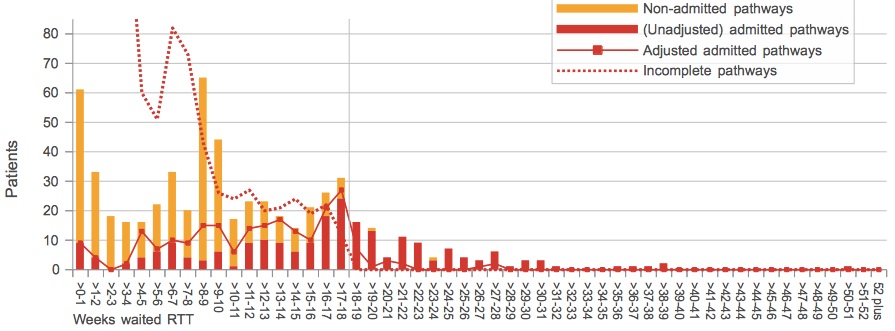
For instance, in the service shown below, the red columns show the number of patients who were admitted, across a range of (unadjusted) waiting times since referral. The solid red line shows the same data, but this time adjusted for clock pauses. Where the two coincide, there is no net clock pausing. Where the line is higher than the columns (as you can see in some cohorts below 18 weeks), clock pauses are being applied. And where the red columns are higher than the lines (in some cohorts over 18 weeks), those clocks are being un-paused again.
So if we count up all the gaps of either kind we can estimate how many patients have clock pauses. In this case, there were 95 detected pauses out of 573 admissions during the month, which is just under 17 per cent. (Similar charts for other providers and specialties are available here.)
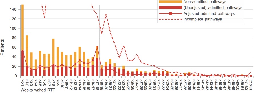
Oxford University Hospital Orthopaedics Jan 2014
Not everyone adjusts
But it’s quite tricky for managers to account for clock pauses, so many don’t bother unless it’s going to help them stay within target. We can see this by plotting the number of clock pauses against each service’s performance on the admitted patient target (and the chart below uses a whole year’s worth of monthly data at Trust-specialty level: some 11,443 monthly services in all). Services with short waits have few clock pauses, but once you approach the 18 week target the level of clock pausing settles down at a steady 5 per cent. (The tall grey spike is at 17 weeks, and it shows how services tend to cluster just below the target.)
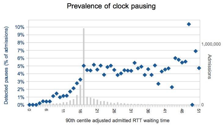
Prevalence of clock pausing
So is that the answer then? Five percent of patients choose to wait longer?
Not so fast. That is only the average. Dig a little deeper and you find a huge amount of variation. Here are all the services at the longer-waiting end (where 90 per cent of adjusted admitted waits are 17 weeks or more), showing the proportion of clock pausing at each individual service. Some have no clock pausing at all. Others pause as many as… well, crikey.
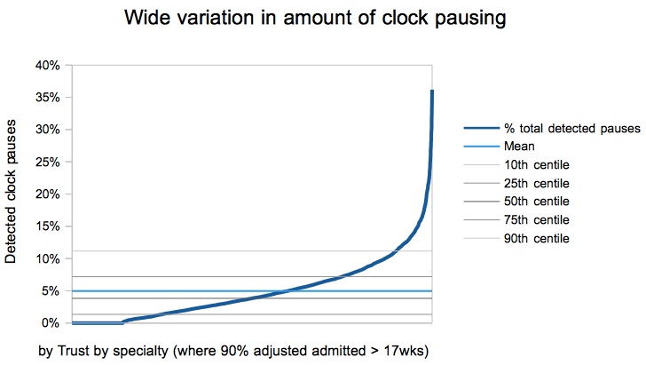
Variation in clock pausing
High levels of clock pausing
The service we looked at above is one of those towards the right hand end. Let’s look at another. If we assume that all pauses were genuinely patient-initiated (and I have no reason to suspect otherwise) then this is a real-life example of a service where some 27 per cent of admitted patients (30 out of 111 admissions) have chosen to extend their wait.
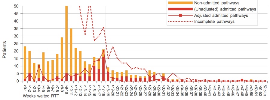
West Middlesex Orthopaedics January 2014
Given that many hospitals avoid accounting for patient-initiated delays if they can, the average of 5 per cent is probably the lower limit. You commonly see this economy of effort in the time trends, where the unadjusted admitted performance varies widely over time, but where only enough clock pauses are applied for the service to limbo under the ‘adjusted admitted’ target.
With that in mind, the next example is interesting because it shows two distinctly different patterns. At first, exactly enough clock pauses were being applied to meet the target: the (unadjusted) heavy solid red line wandered about, but the (adjusted) thin red blobby line clung to the underside of the 18 week target. But last April there was an apparent change in policy (or perhaps people) and clock pausing virtually stopped. (I’m not sure quite how they managed to hit themselves with negative clock pausing in the June 2013 figures though.) Just before the big change, in March 2013, some 57 out of 250 admissions had detectable clock pauses, which is over 22 per cent.
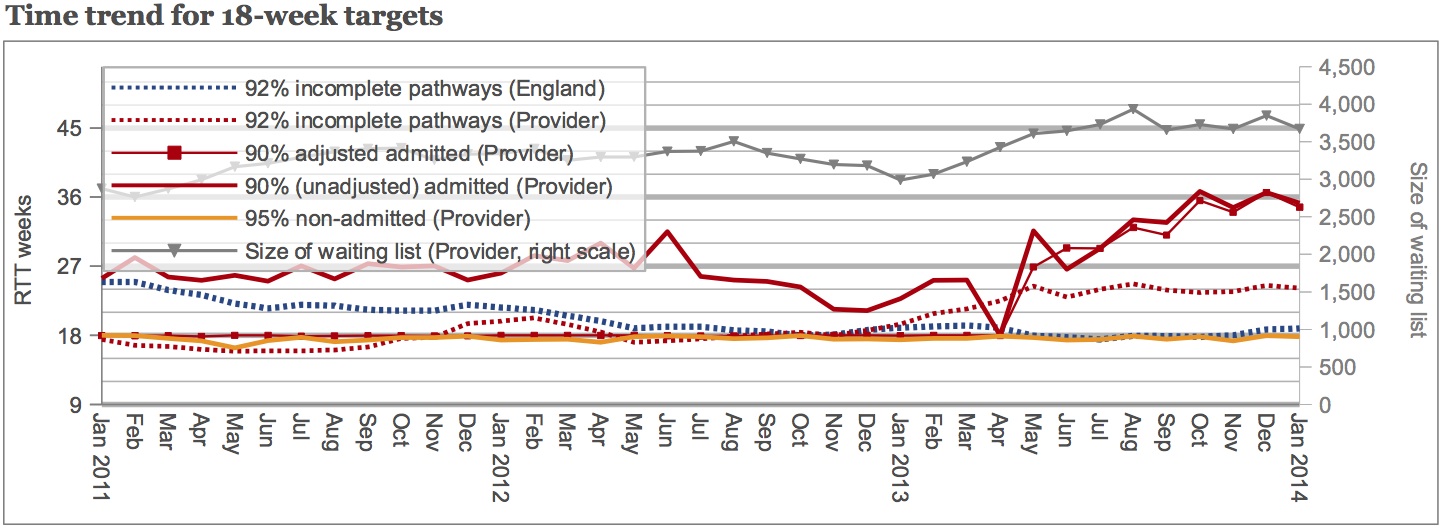
Royal Wolverhampton Orthopaedics time trend
Estimating the true picture
Now that we’ve looked at the figures, can we say how many patients choose to wait longer?
We’ve seen that 5 per cent clock pausing is the average, but that this is likely to be an underestimate of the number of patients choosing to wait longer, because services often choose not to account for clock pauses. We’ve also looked at examples of services where clock pausing trots along at over 15 per cent.
What might the true level be, nationally? Shall we split the difference, and call it 10 per cent?
Whatever the figure, it shows that when managing a service that’s in danger of breaching an unadjusted target, a decent amount of headroom is needed to allow for those patients who choose to wait longer.
And finally: a curiosity in Suffolk
The service with one of the highest levels of clock pausing is Orthopaedics at West Suffolk NHS Foundation Trust. In the latest data (January 2014), some 74 out of 223 admissions (33 per cent) had detectable clock pauses. Nor is this a one-off; over the 12 month period sampled here, in every single month more than 20 per cent of admitted patients’ clocks were detectably paused.
But the high level of clock-pausing isn’t the only curiosity in this service.
West Suffolk Orthopaedics January 2014
If you look at the dotted red line, which shows the number of patients who are still on the waiting list at month-end, you will see there are no waiting list patients beyond 18 weeks. Check back in the data, and you’ll find there weren’t any at the previous month-end either. (The source data used throughout this analysis comes from the NHS England website.)
If January began with no patients on the waiting list beyond 18 weeks, then where did all those long-waiting admissions during January come from? Clock pauses aren’t allowed when reporting on the waiting list, so a comparison with the unadjusted admitted pathways is like-for-like.
I’m struggling to think of an innocent explanation, and if West Suffolk would care to help me out by providing one then I would be most interested to hear it.