

Your cancer control charts are available at gooroo.co.uk/reports/
The cancer waiting times standards are among the highest-profile targets in the NHS. But performance is mixed: the 14-day and 31-day targets (which cover the first and last stages of the cancer pathway) are generally being met, while the overarching 62-day target (which covers the whole pathway from end to end) is often missed.
This is because cancer pathways tend to have lots of stages. If you start with the 62-day target, and then deduct 14 days for the first stage and 31 days for the last stage, that leaves only 17 days for anything in the middle. And there is usually plenty in the middle: diagnostic tests on the primary tumour site, further diagnostic tests for metastases, the multi-disciplinary team meeting, and appointments with the patient to discuss progress along the way.
So it is easy to see how trusts could achieve the 14-day and 31-day targets but miss the 62-day one.
Achieving the cancer targets
So what to do?
First, we need to acknowledge that (in most cancer pathways) we cannot allow 14 whole days for the first outpatient appointment, nor 31 days from decision to treat to starting treatment. In fact we cannot allow permanent waiting lists to build up at all – we have to keep up with demand at every stage of the pathway, even over quite short time-scales, so that patients can make progress along it without delays. In short, we cannot think about any stage of a cancer pathway as having a waiting list in the traditional sense.
Second, once we have mapped a particular cancer pathway and decided on the intended time-scales along it, we need to plan capacity to ensure we can keep up with demand (as opposed to planning based on the capacity we happen to have already, which is what often happens). This can be done using Gooroo Planner.
Third, we need to monitor against the cancer targets in a way that helps us understand the underlying reasons for any breaches of the target. Red/amber/green ratings can be highly misleading (as explained beautifully by Mike Davidge of NHS Elect here) – what we need instead are statistical process control charts (also known as SPC charts or simply control charts) because they are specifically designed for understanding variations in performance.
How control charts work for cancer waits
Control charts are very powerful, but they don’t work in every situation. For instance, you wouldn’t use one to model referral-to-treatment (RTT) waiting times, because RTT waits are principally driven by the size of the waiting list; this is a permanent queue which rises and falls over time, meaning that RTT waiting times are never in statistical control.
So how do control charts work for cancer waiting times? In several useful ways:
1) As discussed above, we can’t allow waiting lists to build up in any part of the cancer pathway. If they do, then the system will go out of control, and this is something that control charts are specifically designed to detect. So a control chart is ideal for alerting us as soon as waiting lists start building up and put our performance at risk.
2) Control charts can tell us whether our current cancer pathway is designed to breach the target. That might sound like an odd thing to say, but this point is key. If the cancer pathway is statistically ‘in control’ – as it should be – then its performance will vary randomly within predictable limits. If that predictable variation extends into breach territory, then the pathway is expected to breach the target from time to time. To stop this from happening, we need to redesign the pathway and/or eliminate any backlogs so that the usual range of variation will be mostly or entirely within the target.
How to do this is a matter for local clinical and operational judgement, and there are many options such as reducing the number of stages in the pathway with one-stop diagnostic bundles, or reducing batching and backlogs by holding shorter and more frequent clinics and multidisciplinary team meetings.
3) Control charts tell us whether any particular breach of the target was a genuine one-off. If a cancer pathway is designed to achieve the target consistently, and we suffer a breach that is truly exceptional, then our control chart will show that the breach was outside the usual range of variation. In that case we should be able to identify the cause.
NHS Improvement have published a good introduction to control charts here
Example – a 62-day cancer control chart
Let’s look at an example of a monthly cancer control chart. It covers the 62-day admitted cancer target at a particular trust, and (like all our cancer control charts) is based on data published by NHS England.
The target is that 85 per cent of patients should not exceed a “62-day wait for first treatment following an urgent GP referral for all cancers”. (You can find a list of all the cancer targets in NHS England’s Cancer Waiting Times Annual Report.)
There are lots of different types of control chart, and we have chosen one which is suitable for percentage breaches of this kind. The upper and lower control limits depend on the number of patients in each month’s data, which is why the blue-green lines vary over time.
(For those who are interested in the technicalities… For an NHS-friendly explanation of the main types of control chart, see this guidance from ISD Scotland. The chart we have chosen is a Laney p’-chart with sigma-z >= 1, because this avoids overdispersion when p-charts are based on large sample sizes – for an explanation see this paper. The statistical analysis was based on the percentage of breaches, and then the numbers inverted for comparison with the target.)
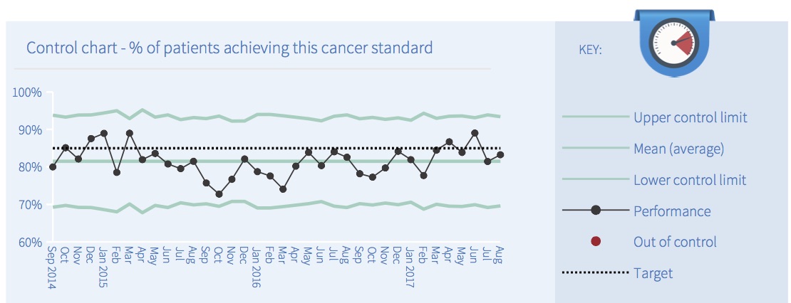
In this example all the points are coloured black to indicate that the system is ‘in control’. If any out-of-control points had been detected then the software would have coloured them red, using the following five tests:
- Outlier: any point outside the upper or lower control limits.
- Shift: a run of 8 or more consecutive points all on the same side of the mean.
- Trend: a run of 6 or more consecutive points either continuously rising or continuously falling.
- Outer third: 2 out of 3 consecutive points which lie close to a control limit.
- Inner third: 15 or more consecutive points which lie close to the mean.
What is the point of these tests? They are checking whether the variation is random or not. If the system is in control, then all the variation should be random. So these tests are looking for patterns that are very unlikely to happen by chance, and if they find anything then that is a sign that something non-random has happened and the system was therefore not ‘in control’.
The next image shows how the monthly cancer reports explain the result of each test (in the middle column). If any test fails, then the box beside that test will turn red, and the big summary box on the left will also turn red.
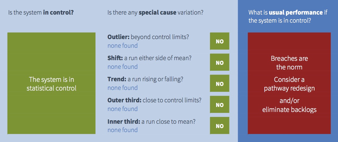
All those green boxes on the left mean that this cancer pathway is in statistical control, so the good news is that performance is predictable. But that doesn’t necessarily mean that performance is good.
We saw from the control chart above that average performance in this example is below the target line. So this cancer pathway is normally expected to breach the target, because breaches are well within the usual range of variation for this system. This is indicated in the image above by the right hand panel which is red.
So this is an example of a system that is in control, but usually expected to breach the target. Managers should therefore forget about investigating any particular breach, and focus instead on redesigning the process so that the usual range of variation is within target.
Taking action to improve performance
What if you did take action to improve cancer waiting times?
If you were analysing performance using your own control charts, you would put a break in the time series to show how performance improved after your intervention.
Unfortunately we cannot do the same with these monthly control charts, because we don’t know what action people have taken or when. So these charts would interpret the improvement as meaning the system was not in statistical control (which it wasn’t, albeit for good reasons), and predicted performance would be based on the whole time series rather than the period after you took action.
Nevertheless you should be able to see the improvement in the control chart, using your local intelligence about when it happened, and watch the benefits feed through as time goes by.
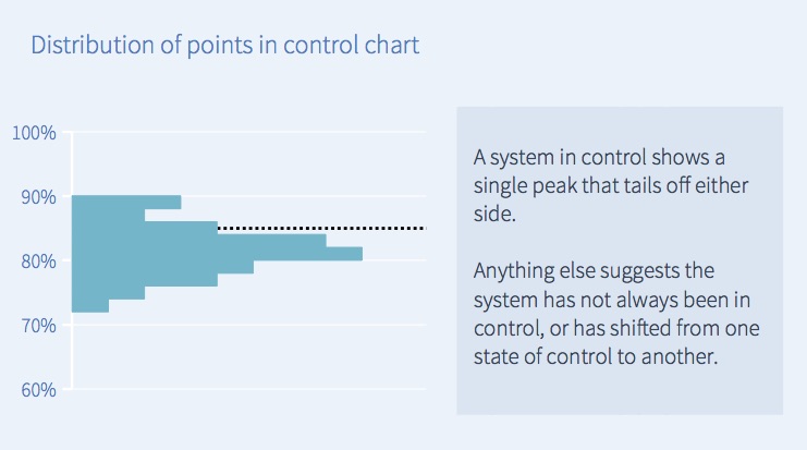
The distribution of performance
Finally, there is a chart at the bottom of each monthly cancer report showing how common each level of performance was. In this example, the largest number of points in the control chart above were around 80 per cent, so in the corresponding distribution chart below the largest bar is also around 80 per cent.
If the process is in control and variation is random, then you would usually expect the distribution to look like the one below – a central spike that tails off on both sides. However sometimes you may see a different distribution, which may be a sign that the pattern has changed or is out of control.
Beyond cancer – using control charts more widely
Control charts are powerful, and you may want to use them to understand other aspects of your trust’s performance.
So we have built control charting into our Gooroo Planner software to analyse (as well as plan) your bed, theatre and clinic utilisation. These tools can help you understand and solve your regular capacity pressures, and so improve A&E and RTT performance.
You can find out more about control charting in Gooroo Planner here, or get in touch and ask for a free on-site demo.